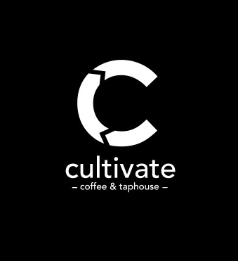
Primary logo
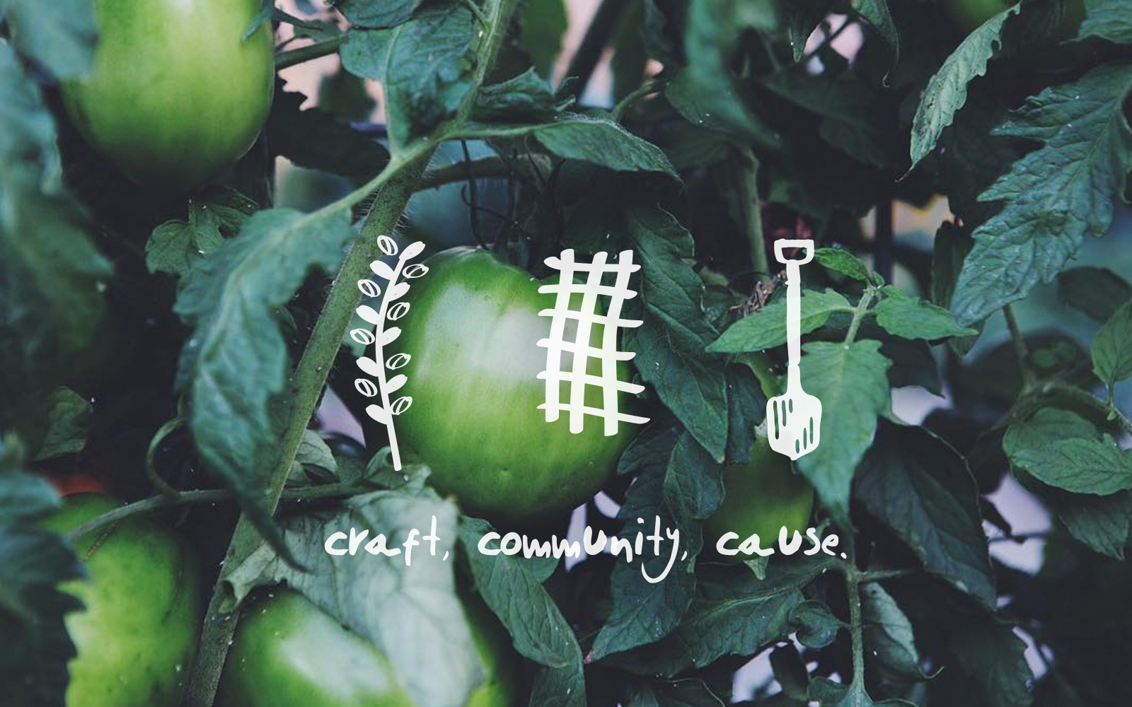
Secondary icons and tagline
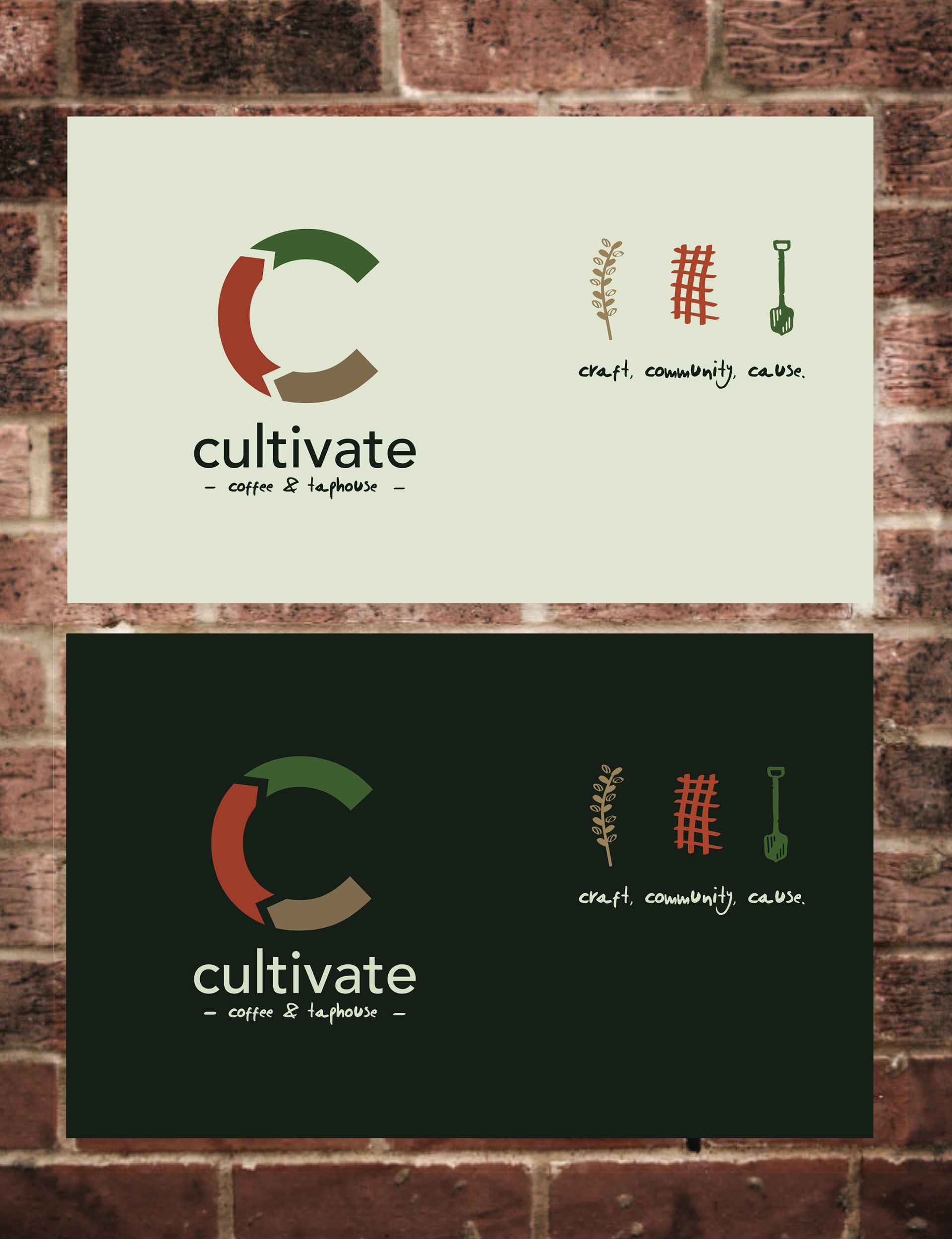
Color palette
Typography exploration
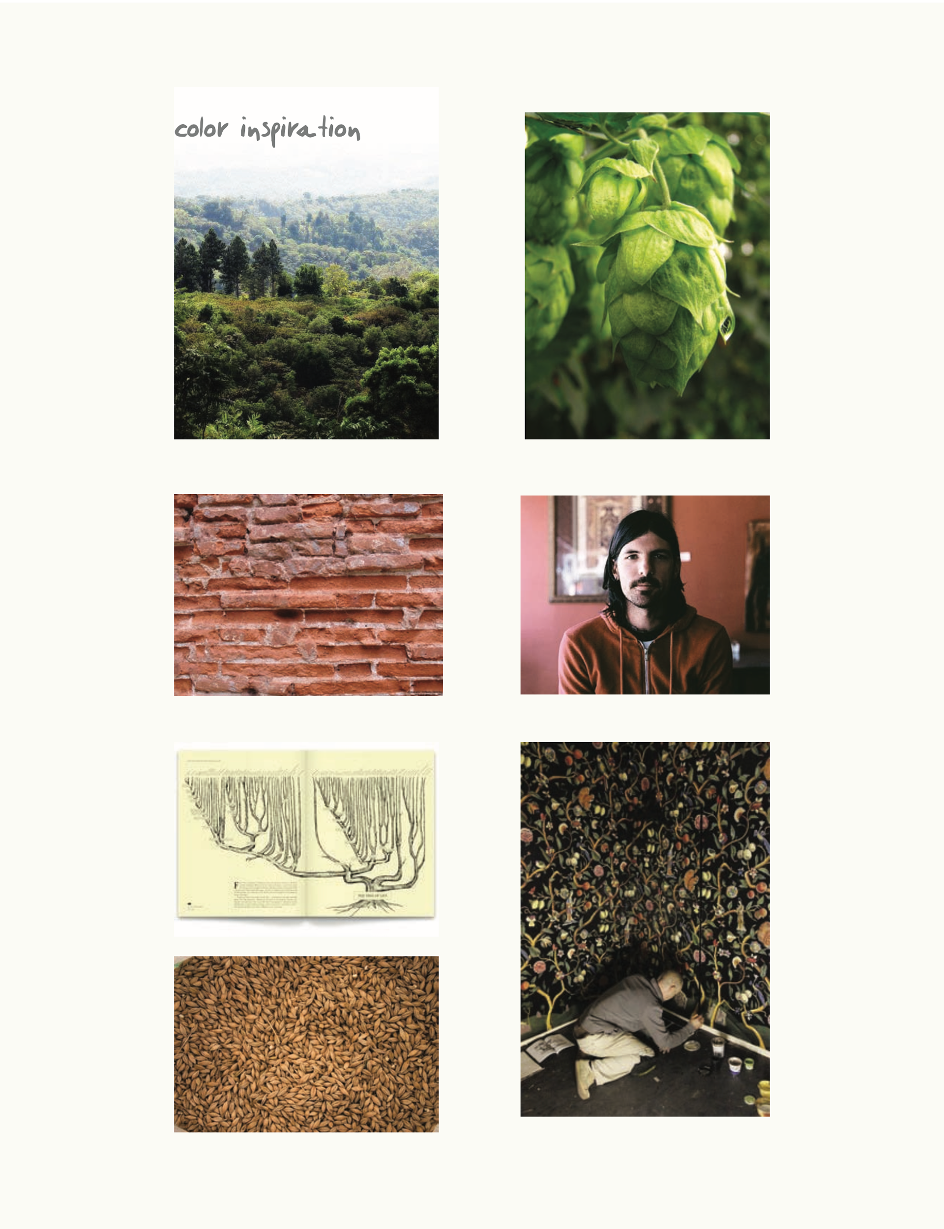
Color inspiration
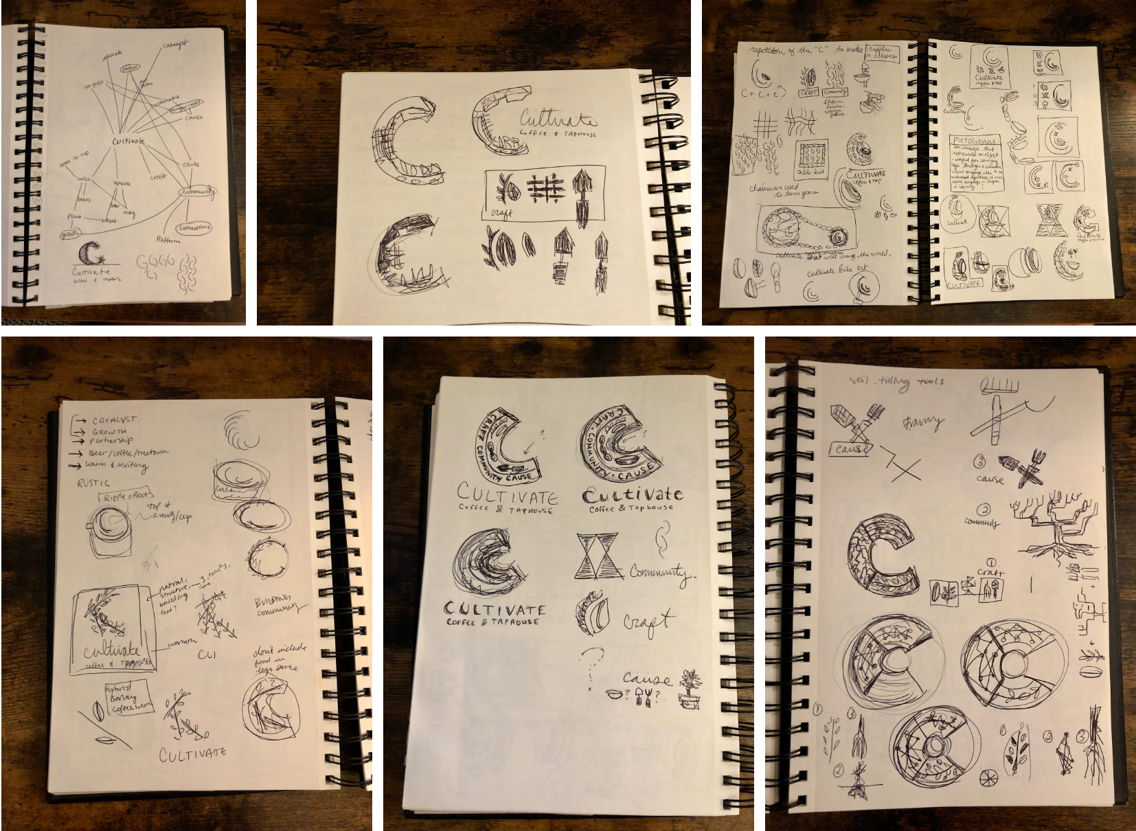
Process sketches
Some thoughts, a few years later:
If I could go back in time and revisit this project, I'd focus more on refining the final logo and building out a robust system of assets for the client.
If I could go back in time and revisit this project, I'd focus more on refining the final logo and building out a robust system of assets for the client.
After more experience designing for environments, I might also approach the logo differently from the outset to best serve important real-world uses like signage, products and merchandise—for example developing a unique word mark with "Cultivate" to avoid repeating the letter C.
My approach to color differs now as well—I would reduce the number of colors in the logo and instead provide guidance on layering colors and patterns to add more warmth and depth to the brand system.
It's been a joy watching Cultivate's in-house design team apply the brand to everything from signage to merchandise to coffee products over the past few years, and I'm proud to be a part of Cultivate's origin story.
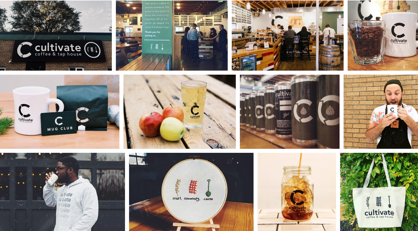
Brand applications (designed by in-house team)